Art 2 Introduction Assignment
|
|
|
|
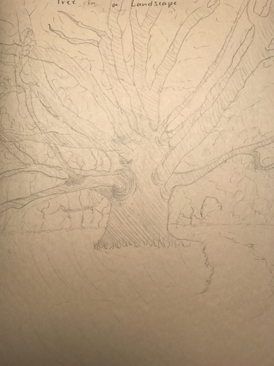
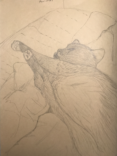
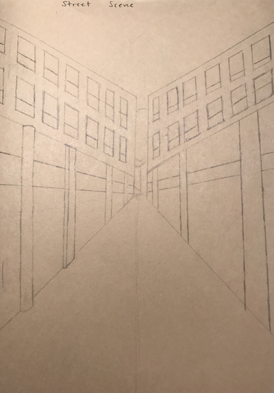
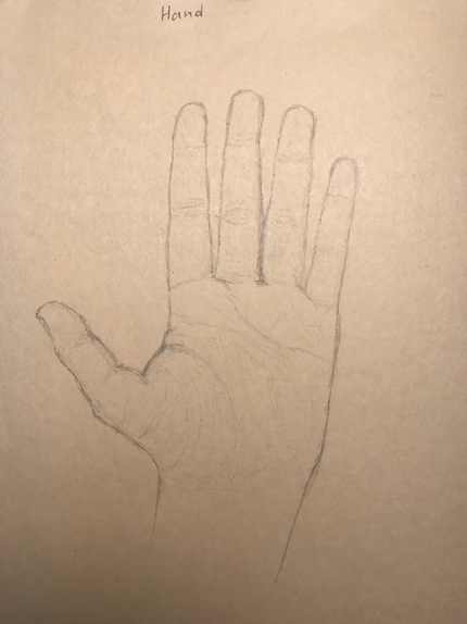
This was the first art 2 drawing assignment. I drew a tree in a landscape, an animal, a street scene, and a hand in pencil.
Value Charts
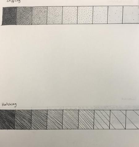
|
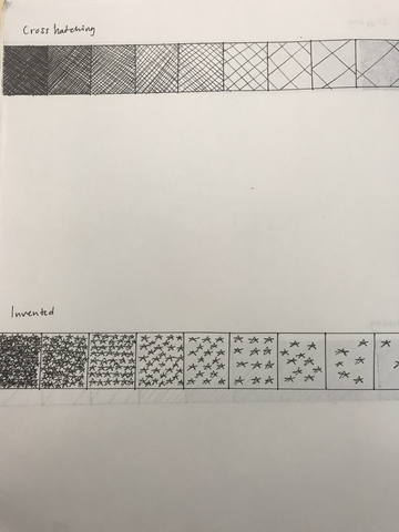
|
these are the value charts I did in pen. The invented are stars.
Stippling Practice
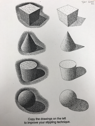
This was a stippling technique practice. I copied the images on the left side.
Pen and Ink Strokes
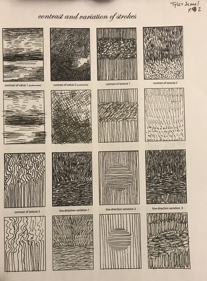
|
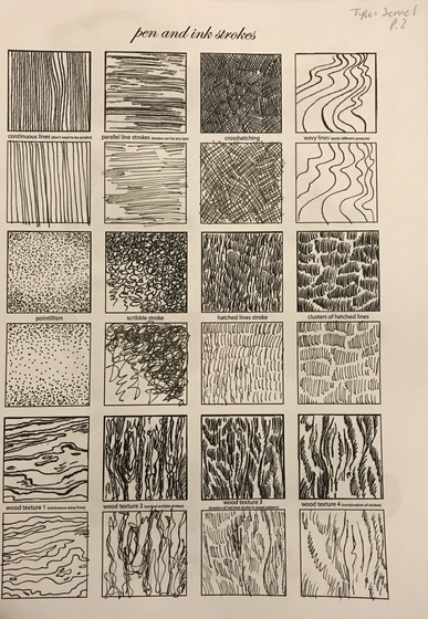
|
I drew some practice strokes and techniques with a pen.
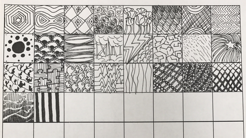
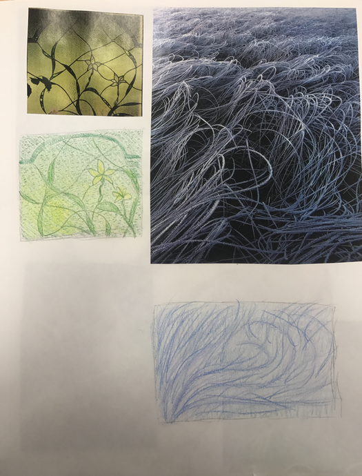
Pattern Elements
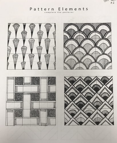
|
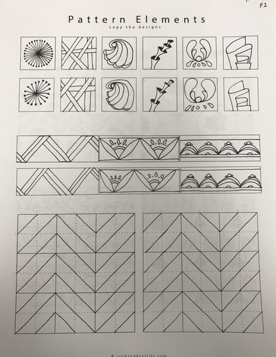
|
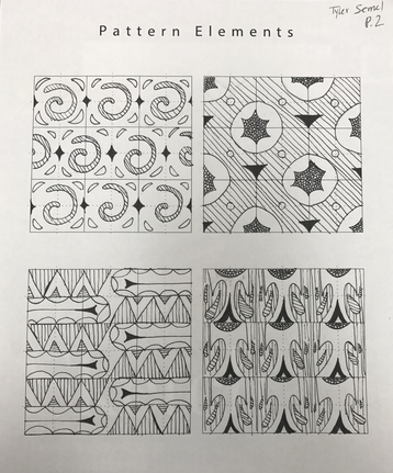
These 3 pages were practice for pen and ink patterns and strokes. I copied the images in the squares as best as I could to match them.
100 Texture Squares
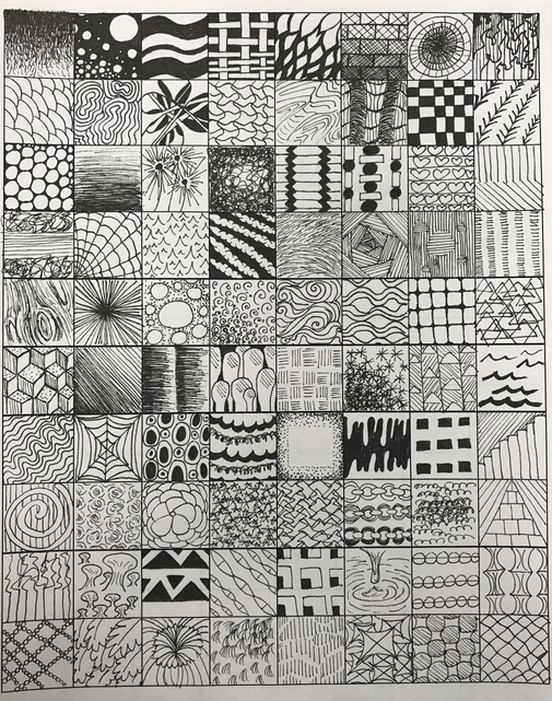
|
|
These two pages are the 100, and a couple extra, textured squares I drew in pen. I created value by making some parts of the square darker than the rest in order to have all different textures.
Landscape Pattern Practice
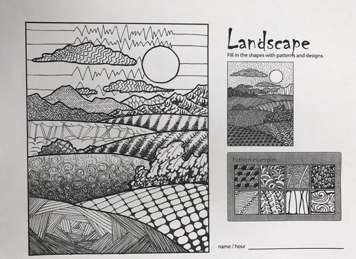
I filled in the landscape outline with patterns from my 100 texture squares. I created shadows with different values using pen.
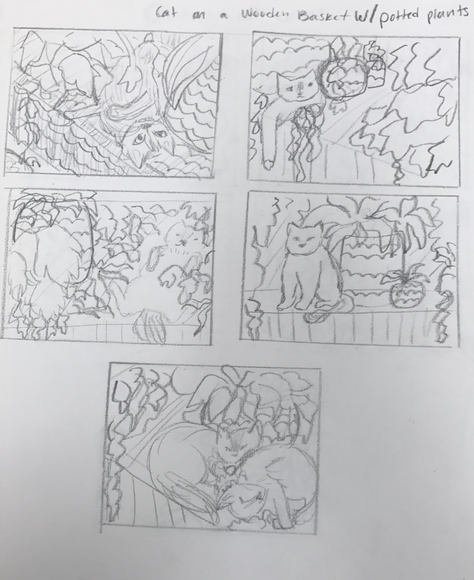
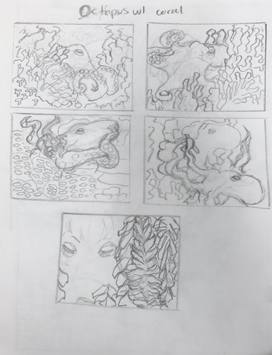
Pen and Pattern Project
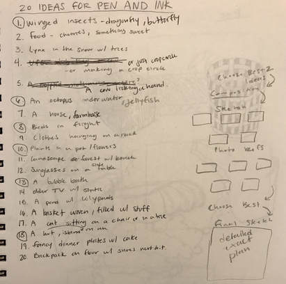
These were my 20 ideas that i then narrowed down.
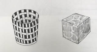
Also just a cylinder and a cube to show how i wrapped patterns around them.
|
|
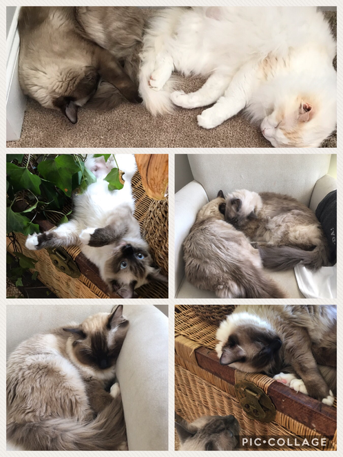
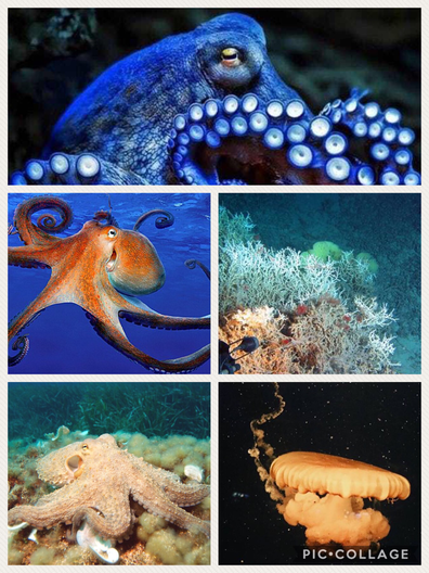
I chose one of my cat prompts for one of my two best ideas. I sketched out the different positions I wanted on a basket with how many cats. I based my sketches on these 5 photos.
|
|
One of my other 2 best ideas was an octopus hiding in coral. I thought that it could be a fun shape to place patterns on.
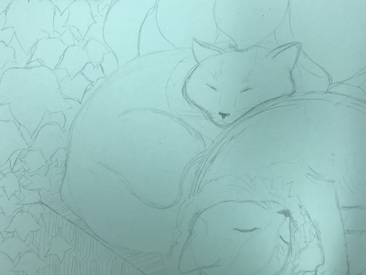
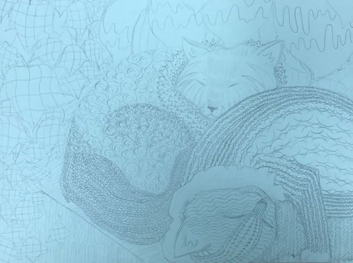
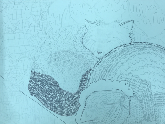
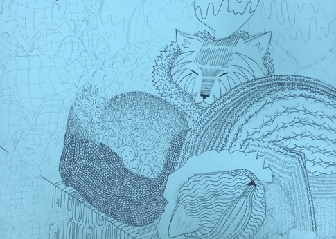
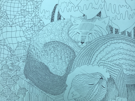
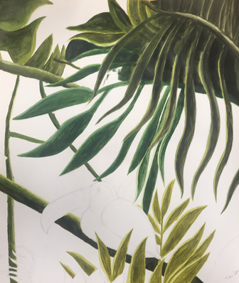
I decided the two cats would look the best overall, so I started sketching my first attempt at what the final picture would look like. I wanted the image to be full of cats and plants on the sides.
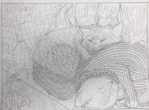
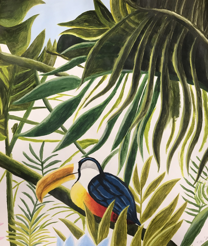
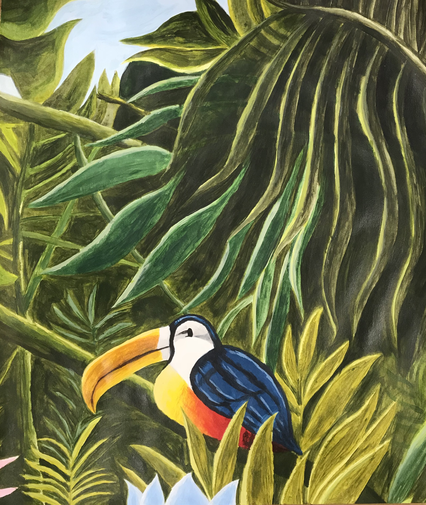
After that I moved onto the final paper, I chose green and sketched it out again.
|
|
|
|
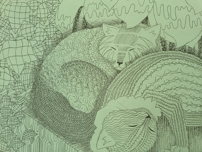
The final piece:
Self Evaluation
1. I made sure my composition was successful by having the front cat overlap the back cat and with the leaves coming forward to not leave any huge empty space. I wanted to fill up the whole piece and and the illusion of a small space where the cats are napping peacefully enveloped by foliage.
2. In this piece I made sure to use softer looking textures for the cat's fur while the leaves were more nonsensical. I wanted the cats to look like you could stroke them and they would feel soft. I also made sure to wrap the patterns around the cats to make it look more realistic in a sense.
3. Value is important because it is was makes something look real or 3D. It makes the object have depth and a sense of placement. Without value the image will look flat.
4. Technically I thought my craftsmanship was alright, I tried to make everything planned out and make the cats anatomically correct in the way they were laid out. I think the one thing I would redo would be the leaves and make those look more real in shape.
5. The practice beforehand helped me immensely as it gave me a sense of how to darken certain parts and keep other parts lighter. It also helped me form many different ideas of patterns I could use.
6. If you don't understand the techniques used in class there's no way to make a successful piece. The techniques show you how patterns connect, how they can be altered, how to apply them to objects and without knowing these things you would'nt be able to apply them anywhere the right way.
7. I think since I am still learning this project was a great help in planning pieces and how to do that. Before I would just wing it and start sketching the final piece right away but now I know how to take my time and make the final piece pleasant to look at.
8. I think I would definitely make my piece have even more value, as of right now it looks a little flat, so I would make it have more depth around the cats. I also would add more different types of leaves around the cats to make the image look even fuller.
Guest Artist Watercolor Project
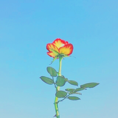
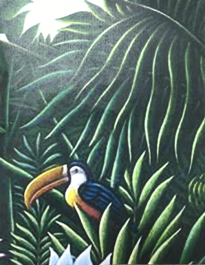
This was my inspiration piece, just a simple flower against the blue sky.
|
|
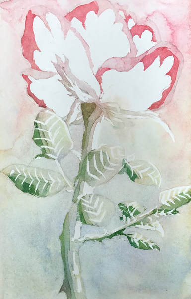
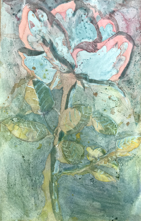
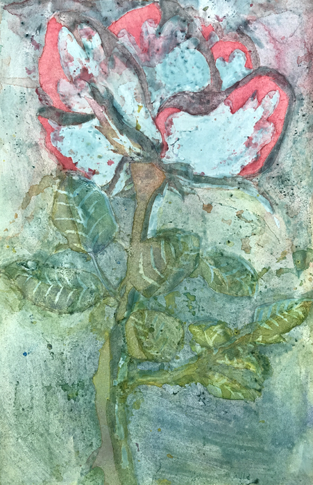
This was my final piece and the two pictures of the process it took to get here. I kept layering the flower over and over again with water color paint instead of the background to make the center piece pop. I wanted to have a better contrast between the background and the flower, so if I were to redo this I would add more layers in the beginning.
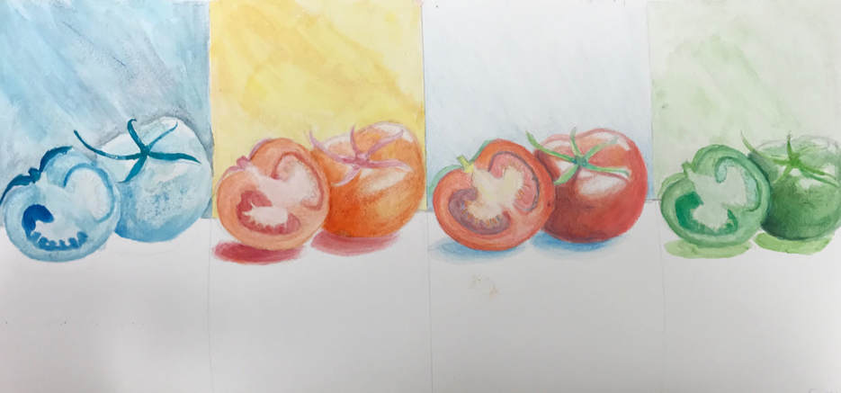
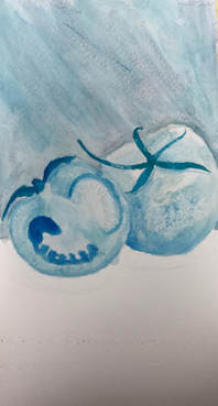
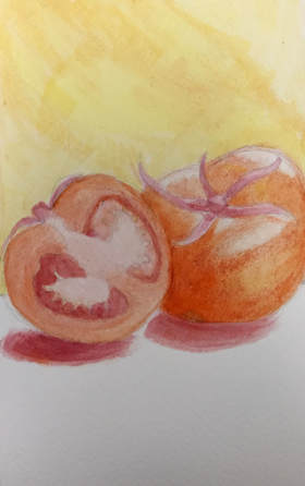
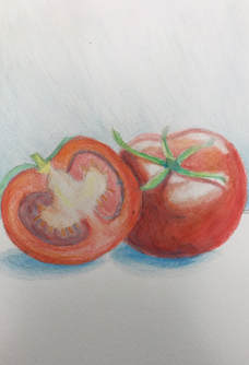
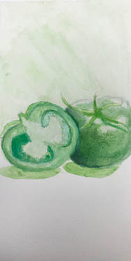
4 Pieces of Fruit
For this project I was given the tomato to make into cool, warm, watercolor pencil, and monochrome colors.
|
|
|
|
I learned about the color and values that you need to consider when shading in different colors on a fruit. The fruit color scheme was similar to that of a summer day with bright greens of grass, the sun, and sky. I think the salt used in the cool section made the fruit look crystallized and very intricate. I found that using water color it was hard for me to be super precise with where I wanted to make my brush strokes stay and where color needed to be.
Color Pencil Objects Practice
|
|
The goal of this practice was to be able to use color pencil and blur the mix between two different colors. I think I did this alright and had a fun time thinking about how the colors would look when mixed together.
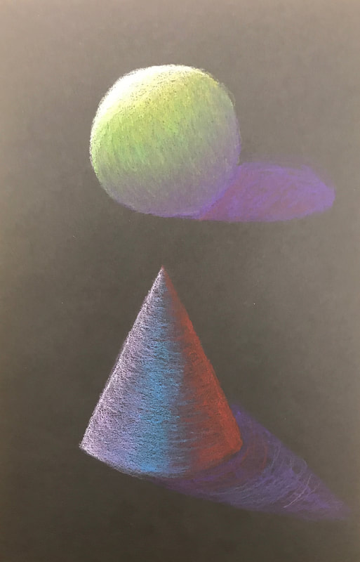
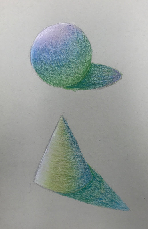
Water Color Practice
This was the first water color warm up I did. I tried to use darker colors for the shading and make the shapes look 3D.
Colored Pencil Practice
I chose these images because theyw ere all very different and had different shades and textures. I think I could add more value next time.
Color Wheel
This is my color wheel with only red, yellow, and blue colored pencils. I tried to make them vibrant and layered.
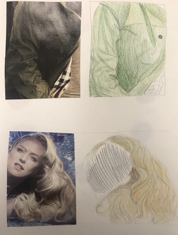
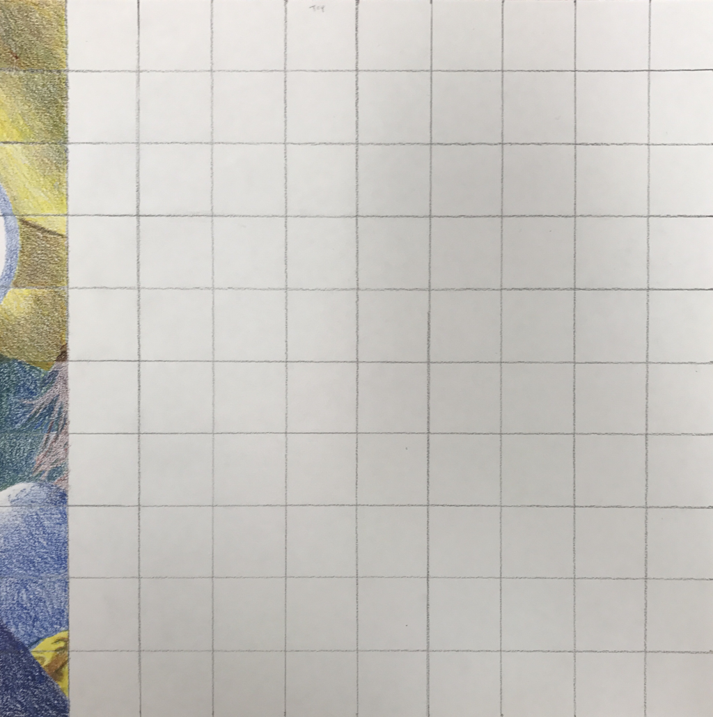
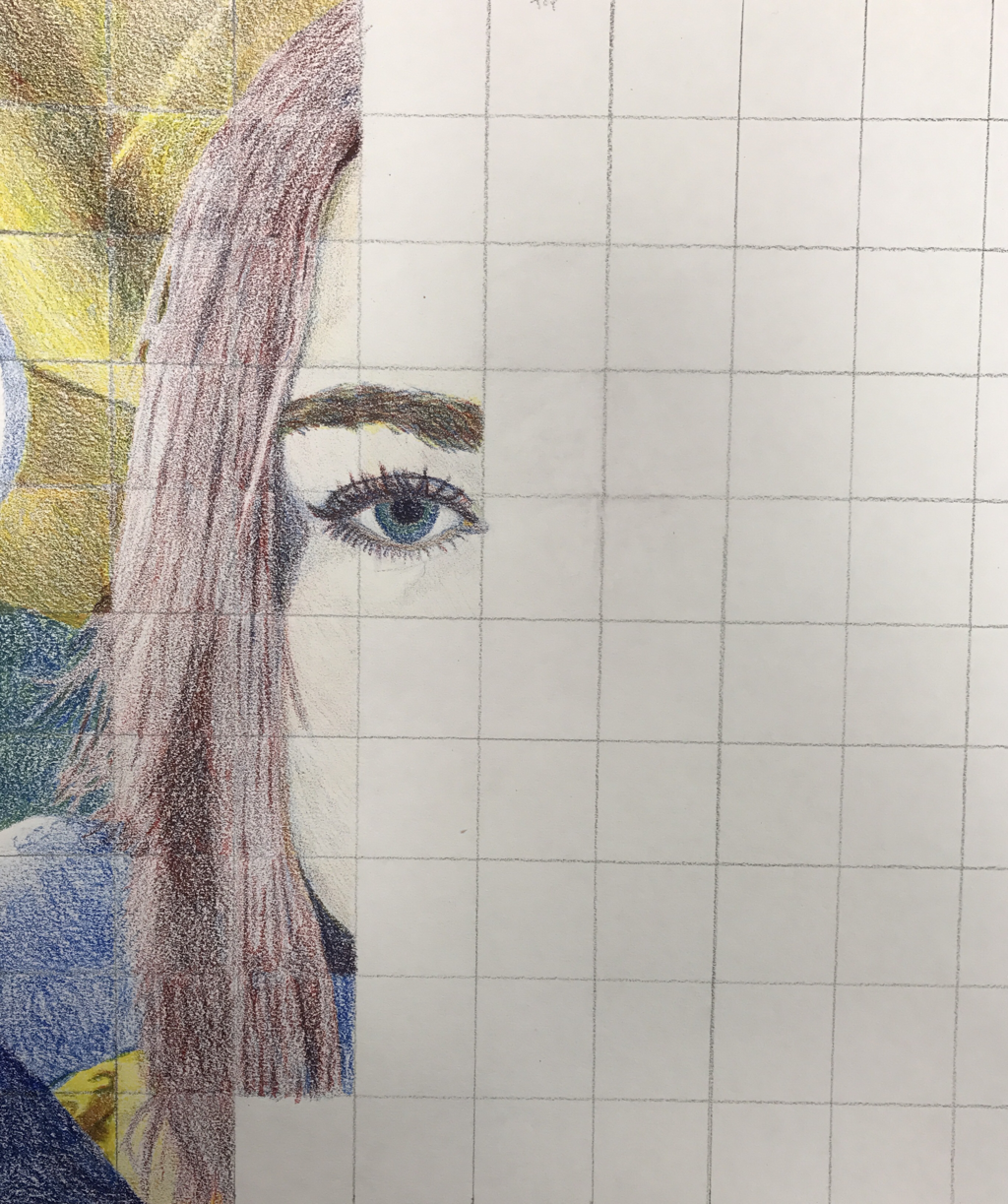
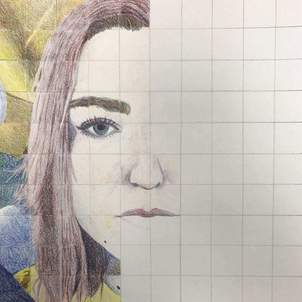
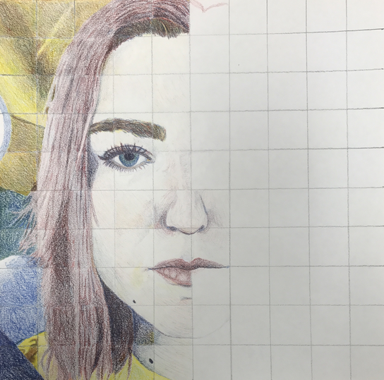
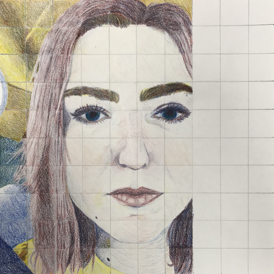
Primary Color Pencil Self Portrait

|
|
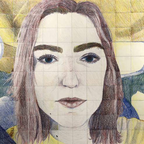
The Final Piece:
1. I think that my portrait is neat as I followed the lines as closely to the original picture as I could. I think that I kept the colors separate and you can tell what is which part in the drawing.
2. The biggest difficulty blending for me was trying to decide whether the color was dark enough or not. I also found I didn't want to press to hard on the colored pencil because I didn't want tot blur every color together.
3. I followed the directions and made sure to draw each grid box separately and tried not to mess with the others boxes when I moved on to the next. This is important because the boxes ensure everything is aligned correctly and the drawing is as proportionate to the real thing as possible.
4. I created value changes by pressing harder at different times and layering more or less whether it was light or dark. I layered a lot for the background because I was trying to emulate the grey that was in the reference picture.
5. I was able to get the color I wanted by looking at the different tones in what I wanted to draw and decided whether to add more cool or warm colors. I also tried blending on a separate piece of paper to make sure it would look how I wanted it to look when I actually put it on the drawing.
6. I think I could improve my portrait by fixing the right side of my face and adding more color to the background. I made my face too pushed in on the right side because I had used too much colored pencil in one square so I had to stick with it. I also think I could make the skin color more layered, but I didn't want to ruin it by pressing too hard and making the face indistinguishable from all its features.
7. I think I was prepared for this project because I had tried layering before, so I was okay at looking at what the skin color should look like. I think this unit was beneficial because it taught me how to be patient with the colors and keep mixing. I also learned about how colored pencils can create the different light and dark shades.
8. I think that Riley’s piece is a good demonstararion of what the colors should look like when blended. She made sure to press the colors down, while I kept mine lighter. I like how bright she made her piece as well, it has a nice shine to it. I also feel like she tried to stay within each bix as best as she could.
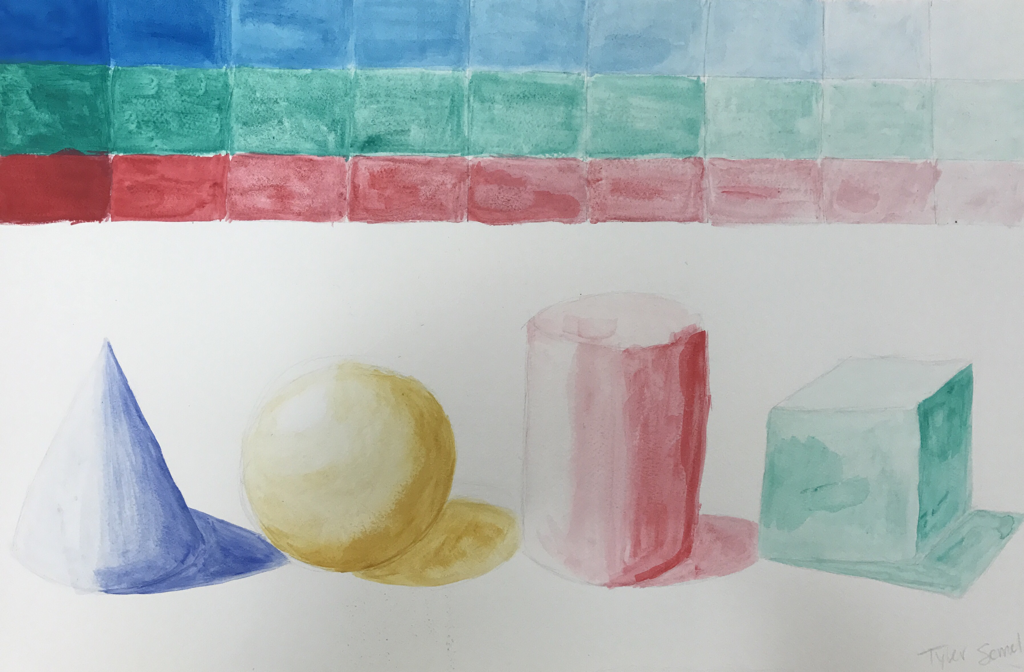
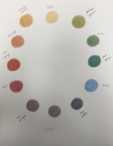
Acrylic Value Chart and Color Wheel
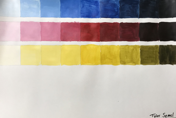
I tried as best as I could to make the transition from light to dark smooth.
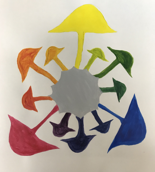
For my color wheel I used mushrooms as my inspiration because of their shape and how many colors they can be in the wild. I used only the primary colors to make every other color in the wheel.
Clay Terms and Pop Artists
Clay Terms – Define each
1. Ceramics: Pots and other articles made from clay hardened by heat.
2. Clay: a stiff, sticky fine-grained earth that can be molded when wet, and is dried and baked to make bricks, pottery, and ceramics.
3. Wedging: To cut clay into manageable pieces and push and press on clay to expel all air bubbles trapped in the clay.
4. Pinch: A method of making pottery in which a ball of clay is pressed, pulled, and pinched into a shape with the hands.
5. Coil building:
Wrapping clay around in a circle, coil, on top of each other to make interesting shapes.
6. Slab building: A thick, flat plate of clay is cut into shapes which are joined together to form an object. The joined edges are scored and slip is used.
7. Score and Slip:
Score is making marks on the edges to two pieces of clay before joining them with slip, which is a mixture of wet clay is used to meld two dry pieces of clay together.
8. Slip:
Liquid clay in water, it’s pretty thick.9. Kiln:
A special oven used to bake/fire clay.
10. Glaze:
A layer or coating of a vitreous substance which has been fused to a ceramic body through firing.
11. Plastic stage:
New clay from the bag, very workable.
12. Leather Hard:
Unfired pottery that has dried and hardened enough to be trimmed or decorated with slip but not hard enough to be fired.
13. Green Ware:
Unfired pottery.
14. Bisque Ware:
Pottery that has been through an initial firing to become durable, yet is still porous.
15. Earthen Ware:
Pottery made of clay fired to a porous state that can be made impervious to liquids by the use of a glaze.
Pop Artists
Warhol:
Andy Warhol was one of the most influential, if not the most influential contributor to the art pop movement. His works consist of enlarging everyday foods and celebrities in panels or vibrant colors. Although he didn’t start out doing artpop, he first worked on actual commercials in the 1960s. This was the basis of his career and later was what inspired him to use his infamous silk-screening technique. Silk-screening is where you force paint or ink through mesh. Warhol’s more famous use of this technique feature Marilyn Monroe and Elvis Presley. There came a major turning point in Warhol’s life after he was shot in 1968 that led to his famous saying, “in the future, everyone will be famous for 15 minutes,” exemplifying how he felt about mass media. Warhol didn’t only use paintings to express his work he also used film, music, and even books. Once he was done with those endeavors he was led back to the commercial art he would become most recognized. His most iconic piece was through his Campbell's Soup Cans Collection.
Lichtenstein:
Roy Lichtenstein was intrigued by art ever since he was in school, so much so that he went on to attend Ohio State University to earn a degree in fine arts. Lichtenstein’s beginning work was filled with an expressionist style and abstract art. He would include hidden cartoon figures in his works at first, but fully invested in the concept after he was done teaching at Rutgers. In 1963 he released one of his most iconic works, Drowning Girl, that displayed a cartoon woman drowning, yet hesitating to ask for help. This work helped to form the art pop movement and keep it alive. Some critics of Lichtenstein said his works were unoriginal and copied his source inspiration completely, he defended himself as he explained that the works need to be close to the original to make a commentary on that media. He made many pop art pieces, but also branched off and created flat panel drawing and sculptures.
Oldenburg:
Claes Oldenburg was influential to the art pop music as early on as 1961. He rented a storefront in New York and called it the The Store, which he stocked with noticeably fake food sculptures and mass-manufactured items. He made his store look like a diner, but with completely inedible food which would be considered the first sculptures of the pop art movement. His works represent the huge scale of consumerism with giant pieces of food and a smaller viewer. These pieces show how we as people are small and how critical he was of American consumption culture. Oldenburg was unlike the other pop artists in that he used a three-dimensional medium to bring pop art into our reality. He was extremely innovative in his use of “soft-sculptures” and ability to turn ordinary subjects into introspective pieces.
Group Painting
|
|
This painting is based off a piece of a larger painting that others in a group also had to replicate. I tried to match the colors as closely as I could and I took my time sketching out exactly where each item needed to be.
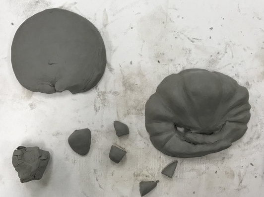
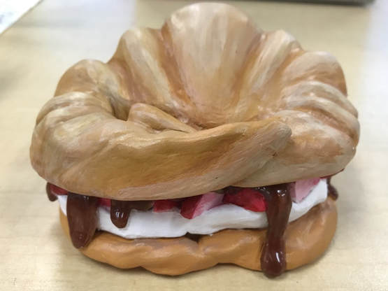
Clay Sculpture
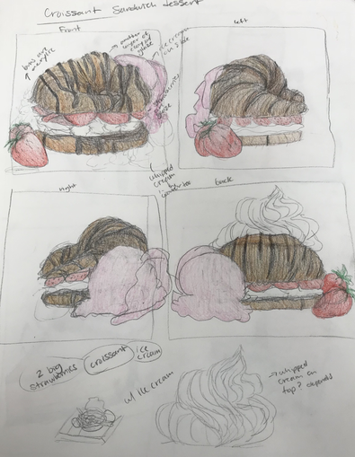
|
|
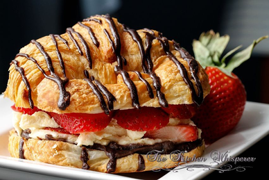
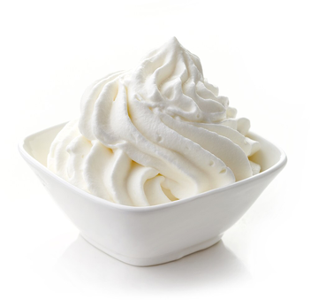
These were my two sketch ideas for my clay sculpture. I decided to go with the croissant.
|
|
These are my reference photos.
|
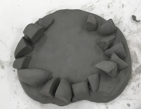
|
These are the in progress pics before the clay was fired.
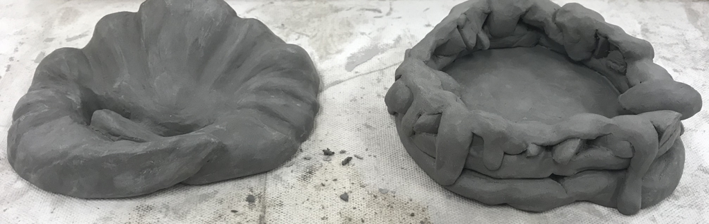
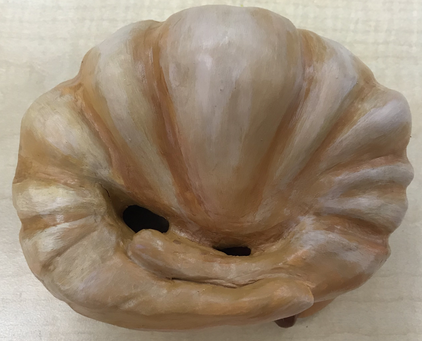
This is the piece completely fired.
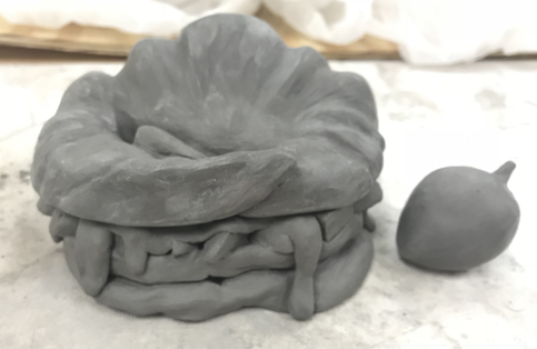
|
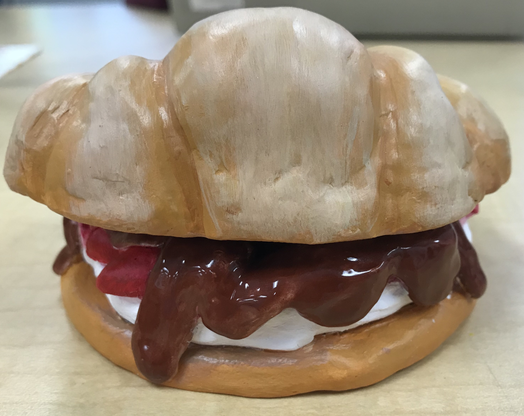
|
This is the final piece glazed and painted.
1. I think my piece is well crafted because I made sure to smooth out all the sides, create ridges for the top, and look at reference photos for what each item should look like.
2. The most difficult part of this project was scupting the chocolate glaze because the clay is hard to mold that thin and then have to slip and score it to make it stay. It took some time before the glaze didn’t look super lumpy.
3. I think my color choices worked out because they’re mostly neutral with a nice pop of red that catches your eye. I would have maybe made the brown on the bottom half of the croissant less orange though.
4. I think my sculpture is interesting from all views because you can see each strawberry and how the glaze was placed. Plus the top of the croissant can be removed so you can see inside of it.
5. Doing a sculpture is different from it being 2D because you have to make sure that you add the texture and that the piece looks correct from all sides. It’s a bit more difficult than adding some color to make a texture because on something 3D it will still look flat if the base isn’t there.
6. I created textures in my sculpture by making the glaze look like it’s flowing, adding lumps to the top to look like it was real, and making the strawberries individual and then attatched instead of molded straight from the glaze.
7. I think my sculpture looks like actual food because I kept the colors of the dough part flat with only the chocolate having a glaze to make it look real and shiny. I also made sure to have the sizing correct and keep the textures funky as possible.
8. If I were to do this project again I would make the strawberries stick out more so you could see them more and make the bottom of the croissant a bit larger so it was more proportionate. I would also connect the cream part more to the bottom of the croissant.
Painting in the Style of an Artist
|
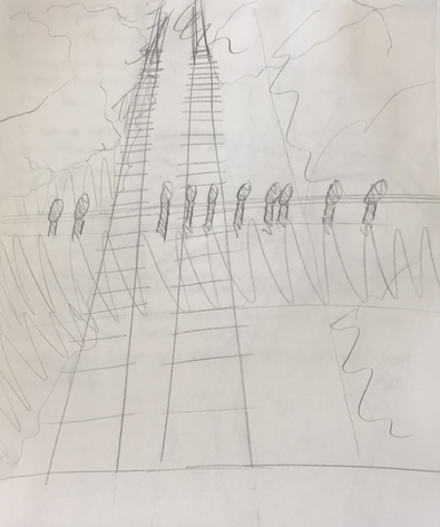
|
These are my two sketch ideas based off of the artist Umberto Boccioni.
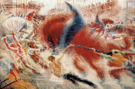
|
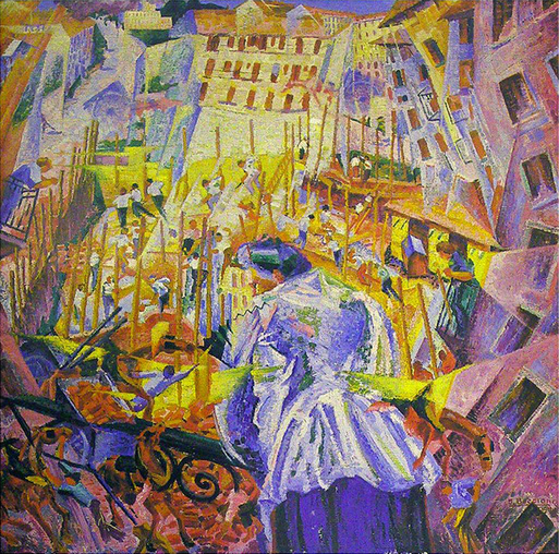
|
These are some of Boccioni’s works that I took inspiration from.
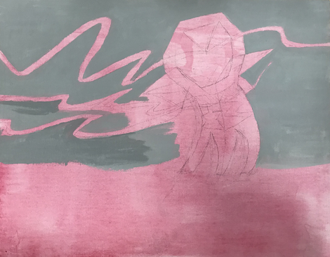
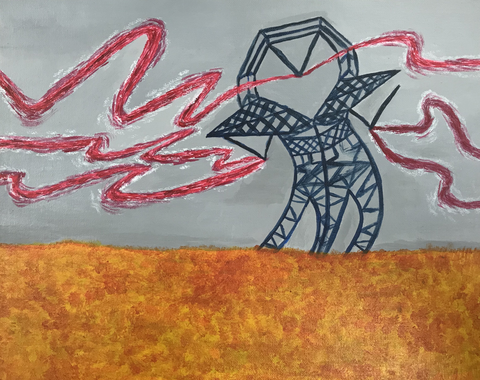
This is my final piece.
1. My referenced artist was Umberto Boccioni. The four main ideas I took from him were movement, machinery, use of primary colors, and quick rapid strokes.
2. I think my project is executed okay in that I didn’t know exactly how to do the bottom half and the metal looks flat.
3. The most difficult part of this project was painting the metal tower because I didn’t know how to make my lines that small and have it look 3D.
4. I used muted and primary colors because Boccioni uses those colors to have a cubist and futurist look.
5. I tried to make the landscape have movement with the wires and the tower moving, but I think the bottom half is too empty and not chaotic enough.
6. I think Boccioni would see my work and say, “yea you tried but it’s not hectic enough.”
7. If I were to do this project again I would take more time with it and create a more in depth sketch. Then I would make the tower more realistic and be more percise.
